Settings
Appearance and themes
Pick light or dark, a theme or a World, and fine-tune colours, fonts and motion.
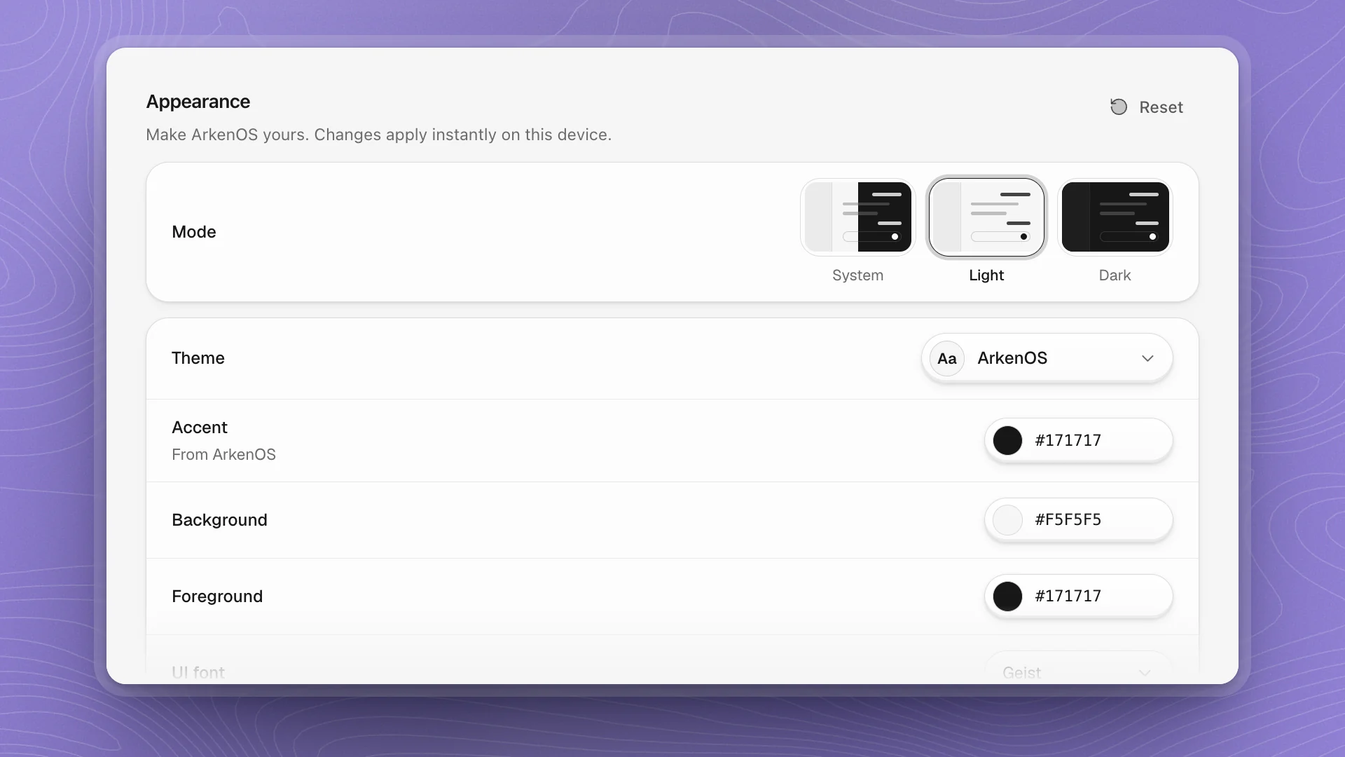
Open Settings → Appearance. Every change applies the moment you make it and is saved on this device only, so each computer can look different. Reset at the top puts everything back to the defaults.
When to use it
- Comfort: text too small or too faint, too much motion, a light room or a dark one.
- Matching your setup: your editor's font, your desktop's accent colour, a translucent sidebar.
- Fun: a World theme for a change of scene.
Appearance is per device: set it on each computer you use. For how workspaces open and how the canvas draws, see Workspace defaults.
Why it matters
You read agent output for hours. A comfortable size and contrast make long reviews of eval tables and diffs easier, and Reduce motion keeps the interface still while you concentrate.
Mode
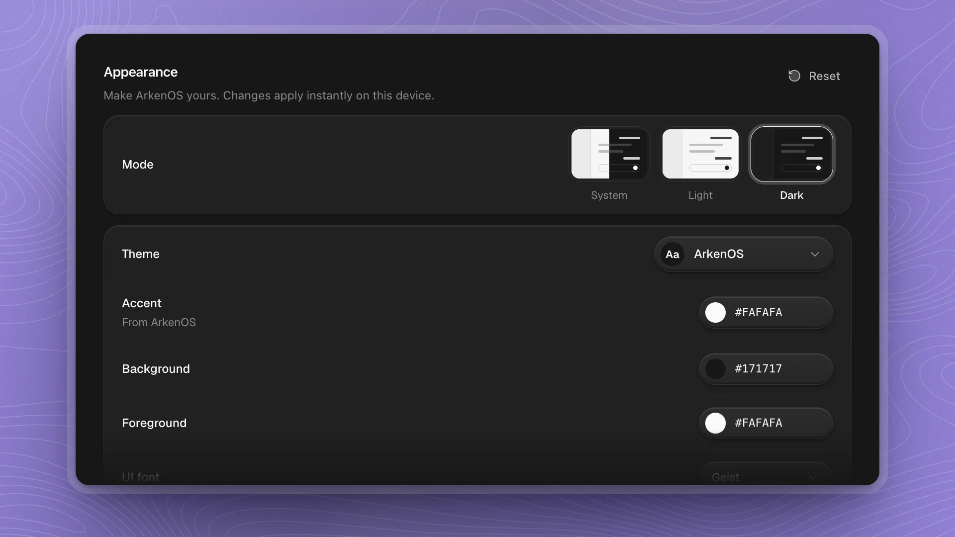
Choose System, Light or Dark. System follows your computer's setting through the day.
Themes and Worlds
Click Theme to open the list. It has two shelves:
- ArkenOS: sixteen house palettes, from the default ArkenOS to Paper, Midnight, Ember, Grove, Glacier and more.
- Worlds: thirty-two themes set in places you know, each with its own light painted across the app. Among them are The Shire, Rivendell, Hogwarts, Tatooine, Arrakis, Pandora, Whoville, Koriko and the Hundred Acre Wood. Each one carries a line about the place under its name.
A World keeps its own time of day, so the Mode tiles grey out while one is chosen. What a World changes, and the full list, are in Worlds.
Colours and fonts
| Setting | What it changes |
|---|---|
| Accent | Buttons, selection and highlights. Shows From the theme until you set your own. |
| Background, Foreground | The page colour and the text colour |
| UI font | Geist, System, Inter or Space Grotesk |
| Code font | Geist Mono, System or JetBrains Mono |
| UI font size | The base size of the interface, 11 to 20 px |
| Code font size | Code blocks, the editor and diffs, 10 to 20 px |
Type a hex value or click the swatch to pick a colour. A custom colour gets a small reset button beside it that returns it to the theme's own.
Turn on Separate light and dark modes to give each mode its own theme, colours and fonts. An Editing switch then appears so you can set Light and Dark one at a time.
Comfort
- Reduce motion: System, On or Off. On calms animations down across the app.
- Contrast: a slider from 0 to 100. Raise it if borders and secondary text look faint on your screen.
- Translucent sidebar: lets your desktop show through the sidebar.
- Use pointer cursors: shows a pointer over buttons and other controls.
- Font smoothing: uses native macOS font anti-aliasing.
Tips
- Long reading sessions: a plain theme in Light, UI font size 15 or 16 (the default is 14), and Contrast a little above its default of 50.
- Screenshots and demos: stay on the ArkenOS theme so colours match the docs and other people's screens.
- Pick a World for fun, a plain theme for focus. Worlds are lively by design; switch back any time.